快速入门
# 简介
ECharts是百度的一个项目,后来百度把Echart捐给apache,用于图表展示
提供了常规的折线图 (opens new window)、柱状图 (opens new window)、散点图 (opens new window)、饼图 (opens new window)、K线图 (opens new window)
用于地理数据可视化的地图 (opens new window)、热力图 (opens new window)、线图 (opens new window)
用于关系数据可视化的关系图 (opens new window)、treemap (opens new window)、旭日图 (opens new window)
多维数据可视化的平行坐标 (opens new window)
支持图与图之间的混搭
官方网站
- https://echarts.apache.org/zh/index.html
# 基本使用
提供了简单示例,更多功能需要查阅官网参数进行配置
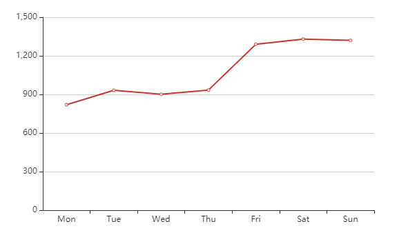
# 折线图
<!DOCTYPE html>
<html lang="en">
<head>
    <meta charset="UTF-8">
    <title>Title</title>
    <!-- 引入 ECharts 文件,本地引入 -->
    <script src="echarts.min.js"></script>
</head>
<body>
<div>
    <!-- 为ECharts准备一个具备大小(宽高)的Dom -->
    <div id="main" style="width: 600px;height:400px;"></div>
</div>
<script>
    var myChart = echarts.init(document.getElementById('main'))
    var option = {
        //x轴是类目轴(离散数据),必须通过data设置类目数据
        xAxis: {
            type: 'category',
            data: ['Mon', 'Tue', 'Wed', 'Thu', 'Fri', 'Sat', 'Sun']
        },
        //y轴是数据轴(连续数据)
        yAxis: {
            type: 'value'
        },
        //系列列表。每个系列通过 type 决定自己的图表类型
        series: [{
            //系列中的数据内容数组
            data: [820, 932, 901, 934, 1290, 1330, 1320],
            //折线图
            type: 'line'
        }]
    }
    myChart.setOption(option)
</script>

</body>
</html>
1
2
3
4
5
6
7
8
9
10
11
12
13
14
15
16
17
18
19
20
21
22
23
24
25
26
27
28
29
30
31
32
33
34
35
36
37
38
2
3
4
5
6
7
8
9
10
11
12
13
14
15
16
17
18
19
20
21
22
23
24
25
26
27
28
29
30
31
32
33
34
35
36
37
38
效果
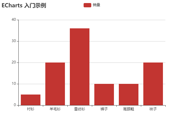
# 柱状图
<!DOCTYPE html>
<html lang="en">
<head>
  <meta charset="UTF-8">
  <title>Title</title>
  <!-- 引入 ECharts 文件 -->
  <script src="echarts.min.js"></script>
</head>
<body>
<div>
  <!-- 为ECharts准备一个具备大小(宽高)的Dom -->
  <div id="main" style="width: 600px;height:400px;"></div>
</div>
<script type="text/javascript">
  // 基于准备好的dom,初始化echarts实例
  var myChart = echarts.init(document.getElementById('main'));
  // 指定图表的配置项和数据
  var option = {
    title: {
      text: 'ECharts 入门示例'
    },
    tooltip: {},
    legend: {
      data:['销量']
    },
    xAxis: {
      data: ["衬衫","羊毛衫","雪纺衫","裤子","高跟鞋","袜子"]
    },
    yAxis: {},
    series: [{
      name: '销量',
      type: 'bar',
      data: [5, 20, 36, 10, 10, 20]
    }]
  };
  // 使用刚指定的配置项和数据显示图表。
  myChart.setOption(option);
</script>
</body>
</html>
1
2
3
4
5
6
7
8
9
10
11
12
13
14
15
16
17
18
19
20
21
22
23
24
25
26
27
28
29
30
31
32
33
34
35
36
37
38
39
40
2
3
4
5
6
7
8
9
10
11
12
13
14
15
16
17
18
19
20
21
22
23
24
25
26
27
28
29
30
31
32
33
34
35
36
37
38
39
40
效果
# 集成
npm install --save echarts@4.1.0
1
Last Updated: 2022/01/16, 11:29:51